Product brutalism
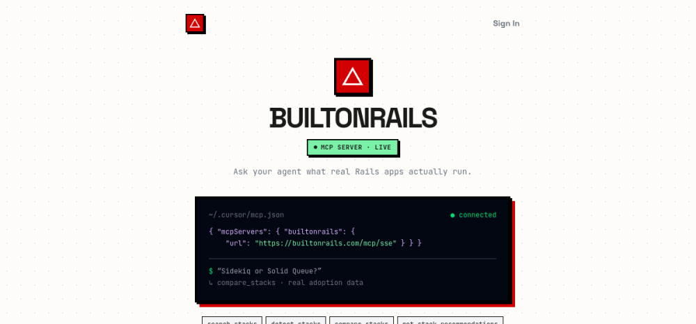
BuiltOnRails
open ↗Dense utility, direct commands, compact navigation and almost no ornamental layer. A product-oriented brutalist reference rather than an art-school one.
Not just “minimal”, “editorial” or “brutalist”. A website can feel like an arcade cabinet, an old operating system, a luxury magazine, a photocopied zine, a toy, a terminal, a pixel game, a scientific instrument or a living 3D world. This atlas is organised by visual taste, not trend vocabulary.
Dense utility, direct commands, compact navigation and almost no ornamental layer. A product-oriented brutalist reference rather than an art-school one.
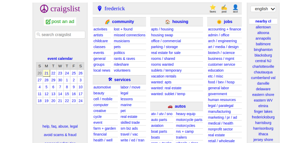
Information architecture is the aesthetic: links, hierarchy, density and defaults.
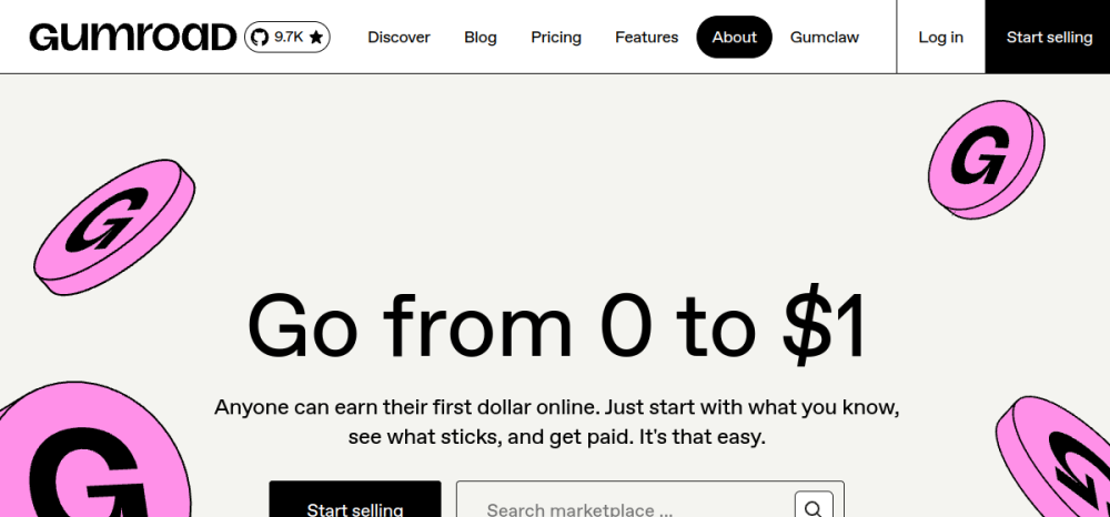

Strict grid, type hierarchy and contemporary studio restraint.
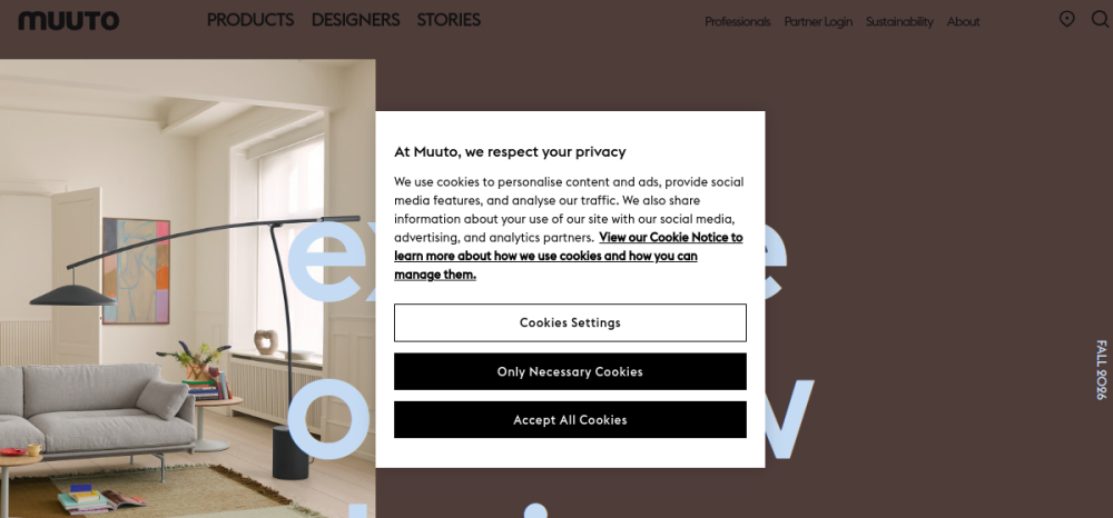
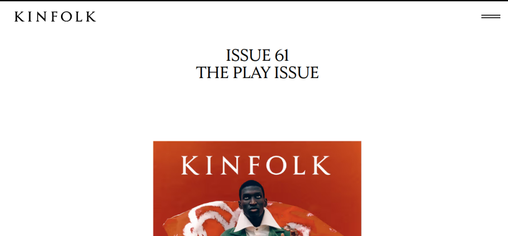
Magazine rhythm, high-end photography, serif presence and generous pauses.
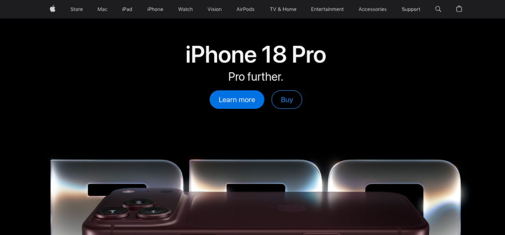
Modular product storytelling, large media and controlled visual hierarchy.
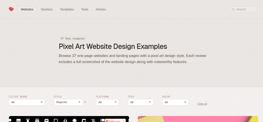
Not merely retro. Bitmap type, hard pixel edges, sprite logic, limited palettes and game-era composition form a distinct visual system.
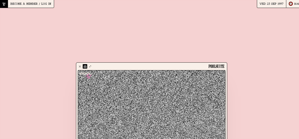

A fake operating system rather than a page: windows, apps, icons, boot states and surreal digital nostalgia.

Monospaced pixel typography, technical UI rhythm and intentionally low-fi digital texture.

Pixels mixed with glass, reflective 3D and digital-era sheen.
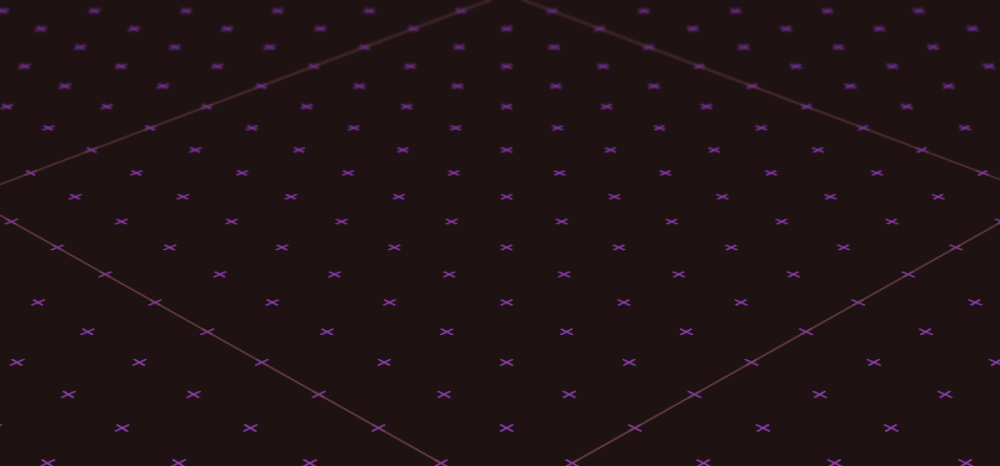
The portfolio is a drivable game world. Navigation, physics, discovery and brand are one system.

Pixel graphics, sound effects and an actual game inside a one-page shell.

Pixel, esports and interactive easter eggs give the site the grammar of a game product.

A creative tool whose interaction feels closer to a pixel editor/game mechanic than a form-driven app.
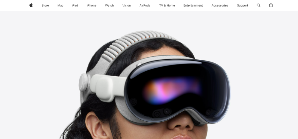
Transparency, blur, depth and spatial layering as an interface material.
Windows, controls and media surfaces behave like remembered physical software objects.

Warm surfaces and friendly illustration create a soft, tactile emotional tone without glass or tech sheen.

Scribbles and illustrated motion deliberately remove corporate polish.

Thin-line illustration and wavy separators give a calm human tone.

Chaos, visual quotation, nostalgia and dense layered storytelling instead of restraint.

Pixel and glitch effects become part of a critical storytelling voice.
Dense information, exact spacing and micro-interaction polish create an instrument-like product feel.

Code, charts, notebooks and data are not decoration; they are the interface.
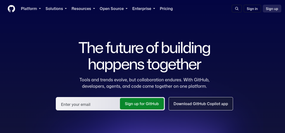
Tables, diffs, code, metadata and state labels create a developer-native visual grammar.